A short (and round) history of the button
 The push button. It’s truly the blunt instrument of UI design. While most other controls provide some indication of the type of operation they’re performing - sliders are adjusting a value, a switch is moving between two states - buttons just mean “do something”. What? The only way to tell is to press it and see. But this shouldn’t be the case.
From mechanical to digital
In the pre-digital, mechanical world, buttons as we know them were pretty rare. Toggling switches were much more common. But when buttons did exist, by necessity they would have a direct physical connection to the thing they were acting on and usually some immediate effect. Unfortunately in the digital realm this relation no longer holds, and that’s what make it so easy to misuse buttons in a user interface.
UX - “Press me”
So, what experience do users have of the buttons in your application’s UI?
The biggest issue is: how will they know the button’s true purpose (without pressing it to see)? Will it open a file or delete the contents of your hard disk? In the wrong hands it could do either of those things, or none. Your only clue is the label. In much the same way as the “drink me” and “eat me” labels in Alice’s Wonderland: the appearance of the thing isn’t congruent with its effect.
The easy way out
Unfortunately the very non-specificity of a button is what makes it so easy to over-use by inexperienced UI creators. If they haven’t thought carefully about the specific operations their users are performing, the quickest thing to do is have pressing a button be the action that invokes whatever functionality you need.
The Apple human interface guidelines stress that you should use a verb to indicate what your button will do, and this is a useful guideline when deciding whether to use them at all. You should only use a button to perform a single well-defined action in a context where the corresponding noun is clear. If it’s not granular enough, maybe you need to break things down into smaller tasks. Think of examples like ‘Cancel’ (whatever operation is underway), ‘Close’ (the document you’re working on).
So how did we get to the current state-of-the-art in buttons?
A visual history
The early years
 Even back in the pre-GUI days of the terminal there were buttons. All you need is some ASCII or ANSI characters to draw a box and you’ve got yourself a button. Of course it also helps if you add a drop shadow or some inverting to indicate a press. Here we can even see a nascent use of the double-border to indicate the default operation.
 Anyone who’s tweaked their BIOS will also be familiar with the text-based buttons there. Unfortunately in these text-based environments, evolution hit a bit of a dead end.
 Meanwhile around 1998, the forerunner of MacOS, NeXTStep, was blazing a trail with chiseled effect buttons. Probably because it only ran on hardware that was ridiculously high-end for the time.
Round rect
In the early days of the Macintosh it became obvious that its creative users wouldn’t make do with boring old rectangular buttons, so instead they got ones with nicely rounded corners. Actually, this was more of a clever workaround for the 1-bit, black and white display. In that environment how could you distinguish between some non-interactive text in a rectangle, and a button? The use of rounded corners served as a simple and obvious visual indicator of this difference. Rounded rectangles became so ubiquitous in the UI that functions to draw them existed in the low-level QuickDraw library, see FrameRoundRect in Inside Macintosh: Imaging with QuickDraw from the early 90s.
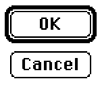
 Strikingly similar is the OK button from the first, DOS-based, version of Windows, that appeared around 1990.
 As Windows evolved, so did its buttons. Version 3.0 introduced 256 colour VGA and the button style previously seen in NeXTStep.
The Borland years
 Around the time of Windows 3.1, Borland were king of the Windows development tool-set with their (VB precursor) Delphi and C++ compiler. These also shipped with a GUI library (the Visual Component Library) that enabled you to make full use of the 16 colours that were available to include an image with the button. So now you knew that, err, OK was good, Cancel was bad.
 As time moved on and Windows became 95, 98, NT and XP, and MacOS 7, 8, 9 and X, resolutions and colour-depths improved across the board. Buttons became more heavily embossed, and that was about it. But, as the functionality that people put behind the button become more and more complex, sometimes simple word (preferably verb) labels were no longer enough.
Shiny!


Nowadays things are getting serious. We have graphical processing units that can generate squillions of pixels per second even on a run-of-the-mill machine. What shall we do with all this processing power? Let’s make our buttons shiny! And transparent. And with a gradient and specular highlight. And let’s make them pulse.
However shiny our buttons get, remember that they’re not a catch-all for every action in your user interface. The golden rule is to use the most specific control that maps closely to the operation that is occurring from the user’s point-of-view.