The 7 signs your UI was created by a programmer
Do you suspect a programmer may have put together the terrible user interface on that “enterprise” software you’re forced to use every day? There are some give-away indicators. Look out for them in your software, hunt down the developer and force them to read a book about user interface design
1. Exclamation marks in dialog box messages Look, it’s probably the 50th time I’ve seen this message today. The fact that this application “Cannot connect to database!” is no longer a surprise. You may have noticed that most professional software uses a neutral tone for its communication with the user. Try that. Also: 1a. Double negatives in confirmation dialogs “Are you sure you don’t want to lose your changes?” Err… what? No. I mean YES. Oh sh*t. Any dialog that requires you to stop and try to parse the question in order to work out if you’re about to destroy several hours of work is not doing its job. It’s getting in the way of you doing your job. In fact, convoluted messages are such a serious issue that Microsoft even tried to help developers to help their users by introducing a whole new kind of dialog box in Vista: the question/task dialog. Good luck with that.
2. No tab ordering defined\mouse only navigation Because no-one’s ever going to use the keyboard to navigate the zillion controls in your data entry app, are they? This one actually surprises me, because I’d have thought that developers would’ve needed to navigate quickly through the application while they’re writing it. Well, that doesn’t seem to be the case. Pretty much all commercial apps are good counter examples. I don’t mean to hold up Microsoft Office as a paragon of UI virtue, but they definitely do the “alternate way of navigating everything” thing well. Everything you need can be reached by both keyboard and mouse. Unplug your mouse and try that with your favourite piece of in-house software and see how you get on.
 3. Group boxes around everything
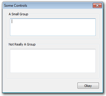
This is a bit of a WinForms specific one. The clue is in the name: group boxes are for grouping logically related controls, not for providing a kewl recessed border around every single one of the controls in your dialog. Don’t kid yourself that this is doing anything other than using up some valuable screen real estate. (See if you can spot another pet peeve in the example dialog, too).
![]() 4. Icons created in the IDE
Look, Visual Studio’s a really good integrated development environment, but it ain’t no Photoshop. Don’t try and use it to create icons. And while you’re at it, please don’t make icons consisting solely of the name of your application (inevitably an acronym) in pixel font and primary colours. Oh, and don’t just steal various icons from another application, unless you’re going to steal the whole lot; one of the key visual aspects of a good UI is consistency. Mixing your hand-drawn 4-bit icons with the glorious 32-bit shiny ones you borrowed is going to be jarring. In fact, why not go the whole way and get someone who can actually draw to create your icons for you? After all, you wouldn’t have someone who wasn’t a programmer writing the code, would you…?
4. Icons created in the IDE
Look, Visual Studio’s a really good integrated development environment, but it ain’t no Photoshop. Don’t try and use it to create icons. And while you’re at it, please don’t make icons consisting solely of the name of your application (inevitably an acronym) in pixel font and primary colours. Oh, and don’t just steal various icons from another application, unless you’re going to steal the whole lot; one of the key visual aspects of a good UI is consistency. Mixing your hand-drawn 4-bit icons with the glorious 32-bit shiny ones you borrowed is going to be jarring. In fact, why not go the whole way and get someone who can actually draw to create your icons for you? After all, you wouldn’t have someone who wasn’t a programmer writing the code, would you…?
5. Data grids Otherwise known as the “Excel is the pinnacle of user interface design” disease. Break the habit. Generally, the more types of controls that are embedded in your grid, the less likely that it’s the right kind of interface paradigm. Yeah, I’m looking at you, person embedding a calendar control, drop down box, graph, slider and checkbox in each row of a data grid. And whatever your 3rd-party grid provider of choice says, it’s not going to do screen redraw performance any good, either.
6. Not implemented message boxes Ahh, the GUI equivalent of source code TODO comments. Of course, it’s an in-house software give-away; no commercial (desktop) software would be brazen enough to ship with bits of functionality dangling from the stumps of buttons and menu items. Would it? Feel free to provide counter-examples if you have them.
[ ]7. Excessive use of dialog boxes
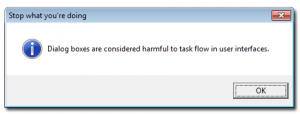
Warning: dialog boxes are considered harmful (to usability). They’re the equivalent of restraining your user by force and preventing her from moving until she answers your question. That might be OK for matters of life or death (i.e. data loss), but not otherwise. Every time you find yourself about to add a new message box, stop, take a deep breath and consider whether it’s really necessary.
So, if you’re a victim or one, many, or all of these user interface faux pas, all I can say is: sorry. I’ve been responsible for doing at least one of these things myself over the years. Consider this post repentance for my user interface sins.