Book Review: Arcade Game Typography: The Art of Pixel Type
 This book sits firmly at the intersection of gaming nerdiness and typographical geekery. It’s a deep-dive into the heavily constrained but creative world of the typefaces of 70s, 80s, and 90s arcade games.
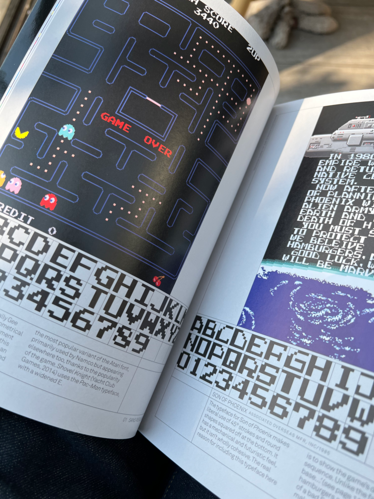
Toshi Omagari’s book is a combination of glossy coffee table experience and reference manual, with both full-colour screenshots and the fonts themselves, laid out in their raw 8×8 gridded glory.
There are plenty of screenshots of the fonts being used in-situ in classic games, as well as more esoteric ones like Yu Suzuki’s lesser known work Dynamite Dux. There are also some interesting historic tidbits about the development of the fonts – including the lineage; how fonts were “borrowed” and adapted by various arcade machine manufacturers rather than being created from scratch.
 The book is organised around font styles rather than decades or genres, so all the serif typefaces are in their own section, for example. Other groups include decorative, slanted and horizontally accented fonts. However if you do want to find a particular game, you can use the index to locate it. There are around 250 by my reckoning, picked from the around 4,500 that Omagari included in his research.
It’s great to see a book like this delve so deeply into one specific aspect of video game design. It uses a set of constraints to restrict the subject matter (8×8, monospaced, pixel-based, arcade games only), but then revels in exploring all the ways in which artists and developers found to squeeze value from those 64 precious pixels. It’s geeky and fascinating.
Arcade Game Typography: The Art of Pixel Type, by Toshi Omagari, published by Thames and Hudson (associate link, or do what I did and buy from here and support your local bookshop).